Your custom Character(s) look beautiful and the whole world should see the same beauty in them that you do. This can be made much more difficult than it needs to be if you don’t know how to take good pictures of them. While I’m, by no means, a professional, what I CAN do is show you some beginner tips on how to better frame and compose not only screenshots in Koikatsu party, but also in any game with a photo mode
Introduction
So you love the character you created? Only natural. We all grow to love the characters we create. We attach certain personality traits to them and (in our heads) make them more than just an image to look at. They become a full fledged character to us. The only issue… is getting others to see the entirety of that CHARACTER, instead of just a shell. The way we do that is by demonstrating what we like about our custom characters through pictures. If you’re not familiar with techniques relating to posing and emoting or techniques related to photography or art though, you might end up giving the wrong message as to who your character is. I’ll teach you the very basic and even some intermediate techniques you can use to make your pictures feel a lot more lively. Techniques including:
- Better understanding emotions and how to express them on your characters face as well as how they carry themselves
- Understanding the basics of larger and smaller muscle groups and how we use them to make your poses have more weight to them, as well as looking more natural/less robotic
- Understanding what is and is not the main focus of each shot and how to naturally bring attention where we want it
- Understanding framing and how it adds or detracts from the overall feeling of a picture
Chapter 1: Creating More Human Looking Facial Expressions
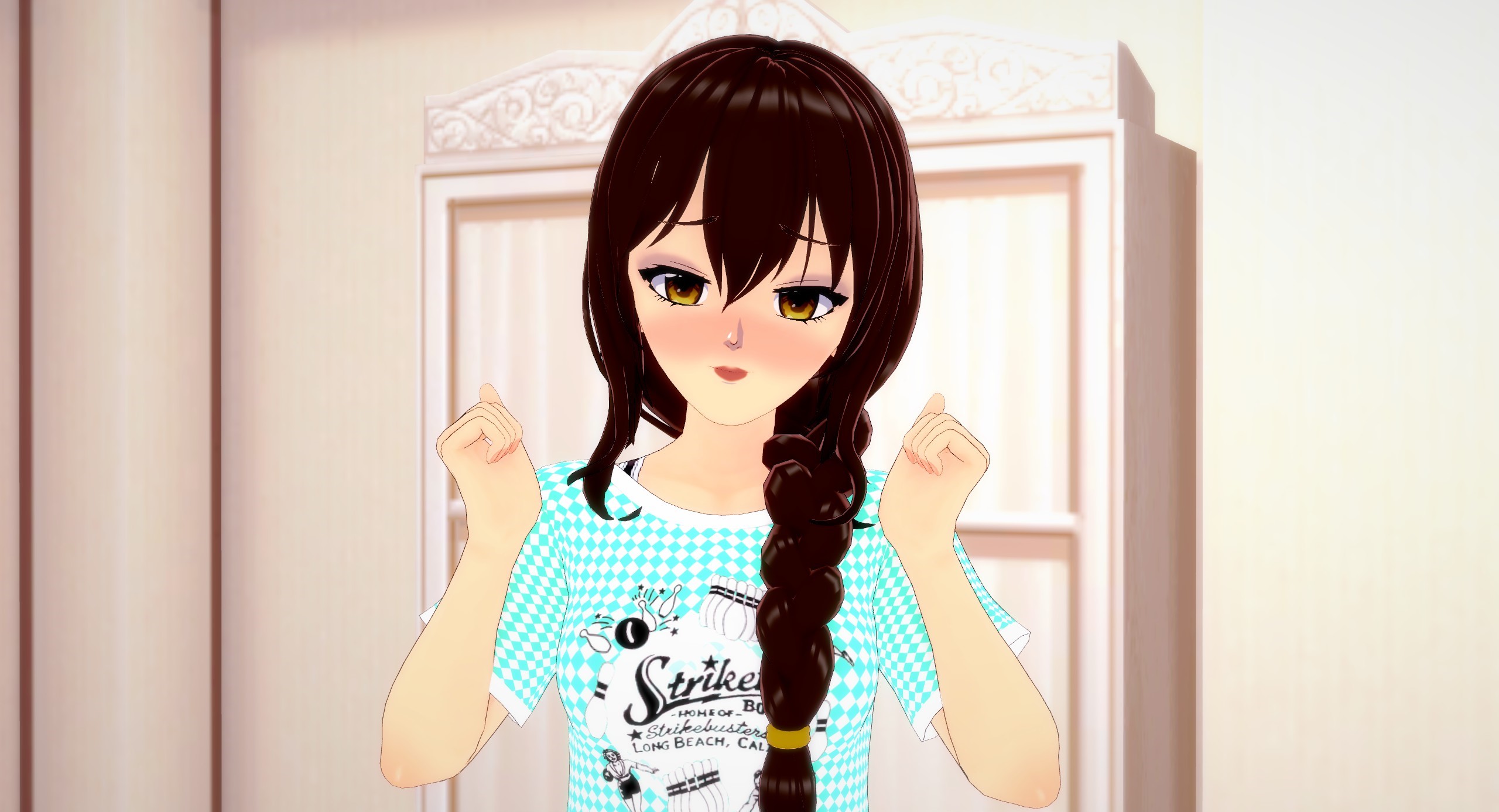
For the entirety of these next few sections, I’ll be using my own custom character as a model to demonstrate the various ideas and techniques we’ll be learning. For this picture specifically, let’s start with something simple like just making her look happy. To make things quick and easy, we’ll start with a pre-made, happy looking pose, with a default facial expression

It’s boring at best and creepy at worst right? But why? Well because like it or not, your pictures, whether they’re good or bad will immediately make the viewer think or feel something. With our character having such an energetic pose but such a blank or even serious looking facial expression, it creates a very jarring disconnect where our minds can’t tell what emotion she’s feeling at all. This makes us feel uncomfortable in what’s known as “The Uncanny Valley”.
Let’s fix it then. But… how? Well by first understanding more deeply what emotion we want our character to express. We need to be as specific as possible because, from an artistic standpoint, what does it mean to say “She’s happy”? Okay… happy about what? How happy, etc. so again, let’s be more specific.
I want her to look ECSTATIC, overjoyed, maybe she just saw the cutest thing in the world and it makes her heart burst with joy. Let’s start, then.
To keep things simple, we’ll just work from top to bottom so, first thing we’re going to change is her eyebrows
I chose a more nervous looking eyebrow pose because look at any picture of someone who’s overjoyed and their eyebrows alone usually look more scared or worried. This is because when we’re overcome by any emotion, our face tends to really scrunch up, contort, whatever, in order to REALLY let others know that whatever we’re feeling, we’re feeling it times 10. But I digress, we’re getting a little ahead of ourselves. Let’s move on to the eyes.
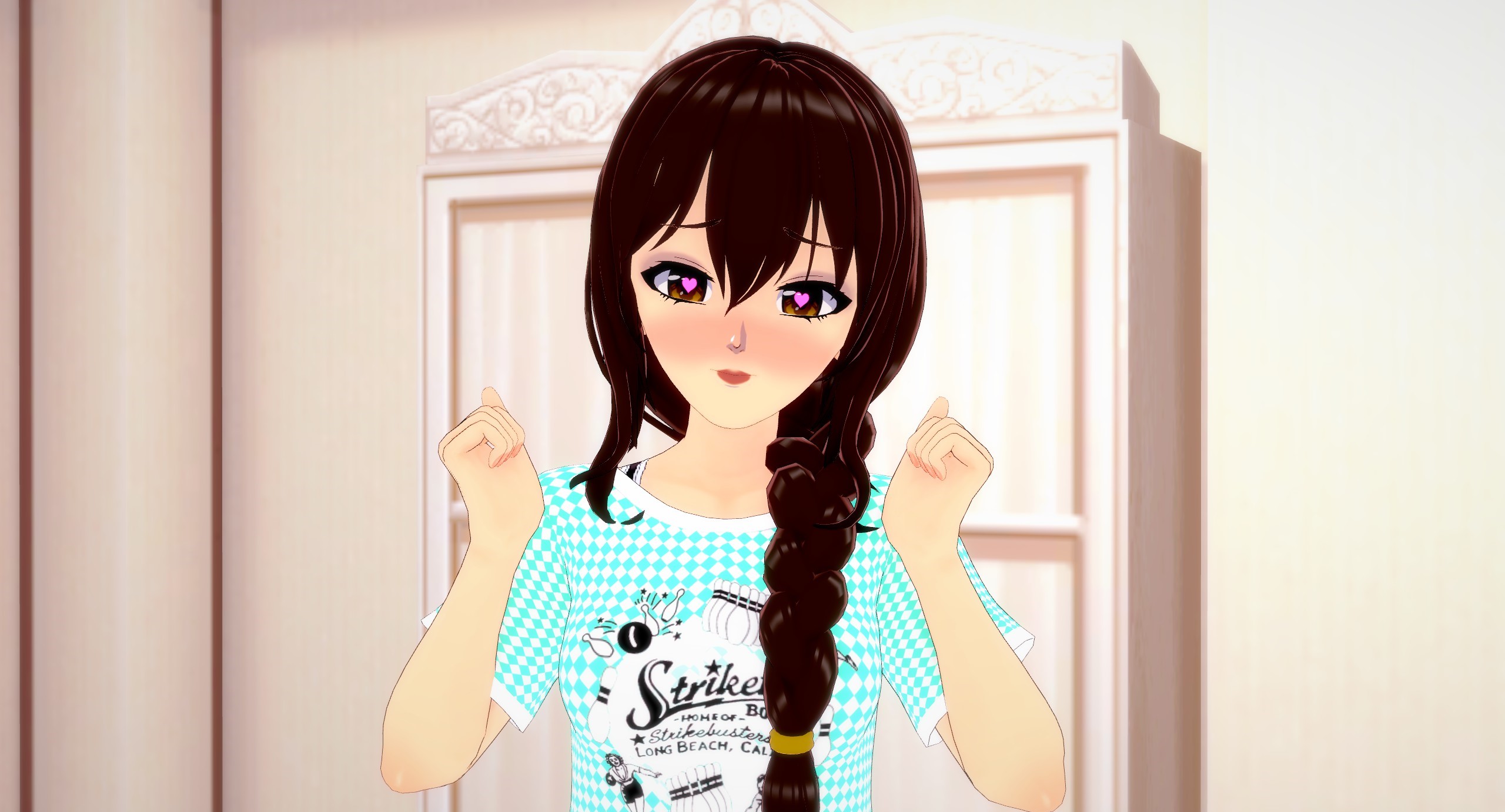
Again, we’re going with a more scrunched up look instead of her original relaxed looking eyes. The hearts definitely help a lot but because her eyes are (again) more scrunched up, she looks like she can barely even manage or maintain the emotions she’s feeling. Next up the mouth.
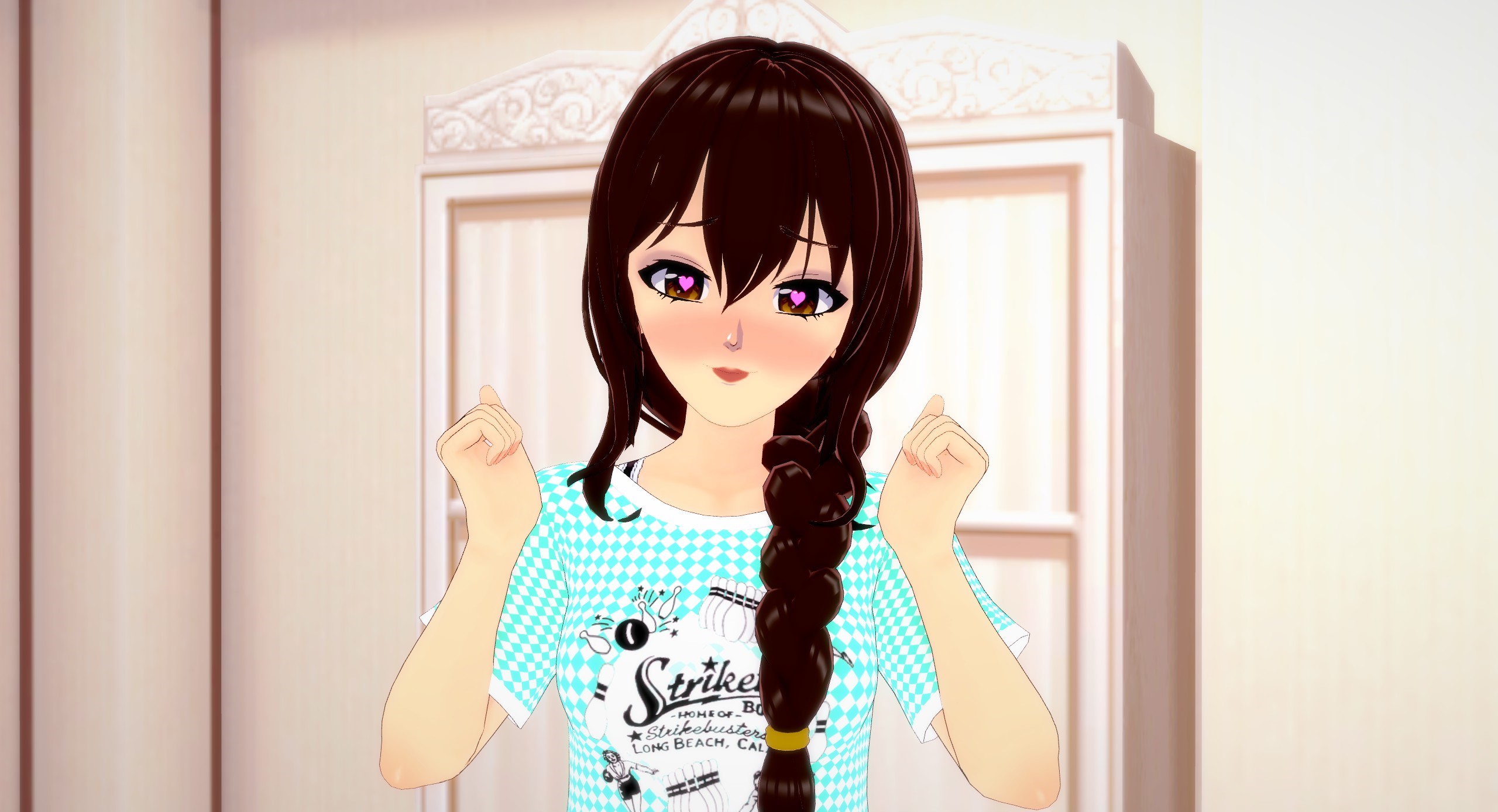
Hmm. It almost looks the same as the previous picture and that’s exactly the problem. It’s not expressive enough, especially not for an emotion like ecstasy so let’s give her a wider, more open smile.
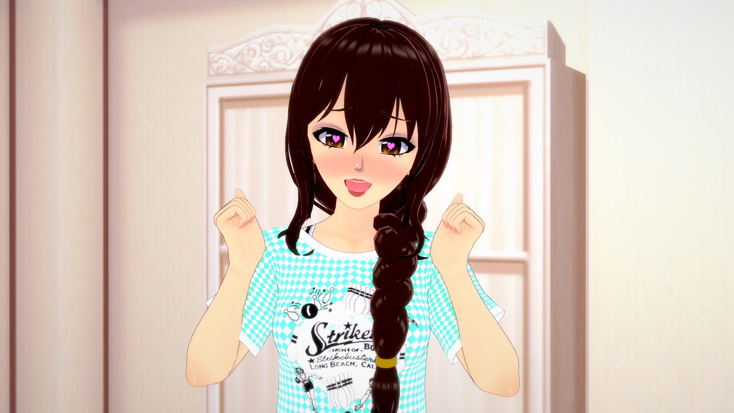
Looks so much better than what we started with, right? It’s because nearly every part of the body goes into expressing emotion and so we have to think carefully about what every part is saying and what they all say, when paired with one another. What do I mean by this? Well let’s look at what happens when I use the exact same pose that we used to make her look ecstatic but this time, we’ll change her facial expression.
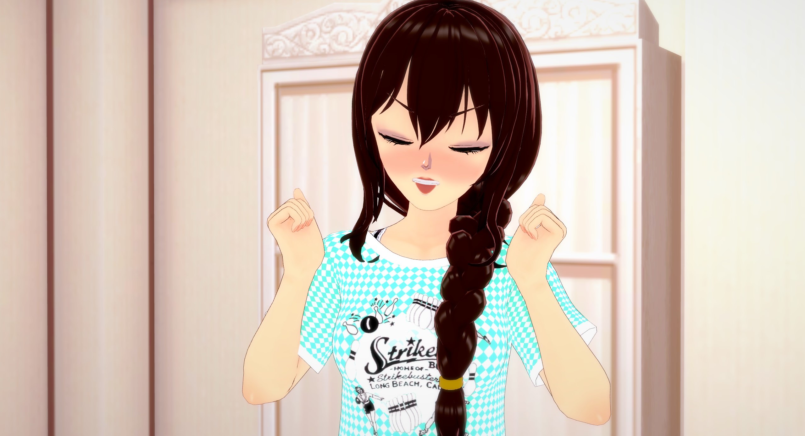
She looks really frustrated now, right? Let’s make it a little more subtle by only changing the eyes and mouth from the original picture.
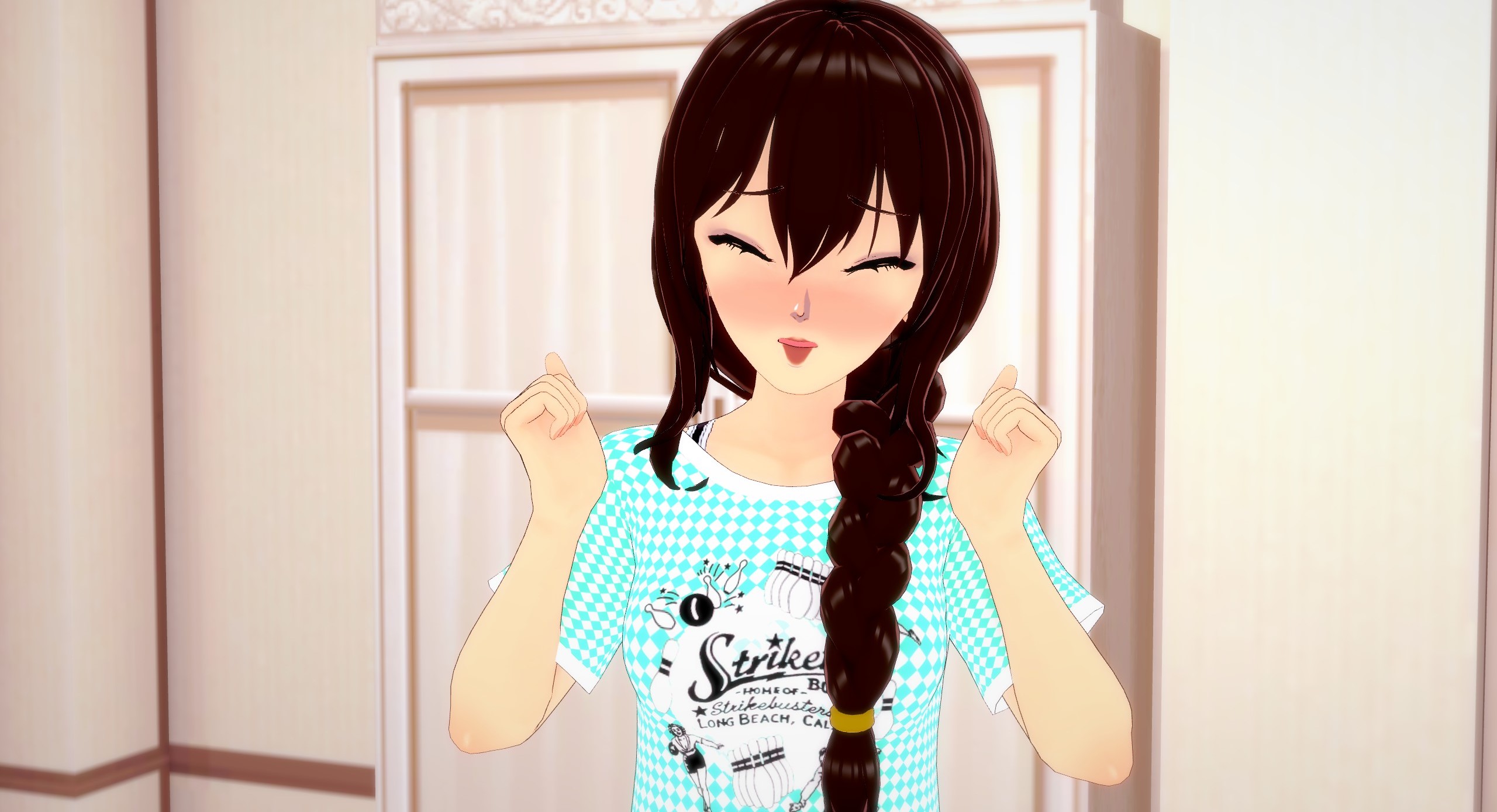
Now she looks very flustered or worried. That’s what we’re learning, in this chapter; the smallest adjustments can make a picture have an ENTIRELY different meaning and thus, we have to think about all of the little details and how they impact one another.
It helps a lot to reference different sketchbooks, art textbooks, drawing tutorials or even study a little bit about human emotions and how we express them physically in order to see the differences in stronger or more subtle emotions. The main thing I really want to hammer into your head is the idea that we don’t just express emotion through one single body part or muscle group, but that our WHOLE body works together to show off how we’re feeling. This leads us into our next section.
Chapter 2: Making Poses Look Less Stiff
So we’ve covered the basics on how to make our character look more animated with their facial expressions. Let’s take it one step further, now, and pose them manually. If all you’re looking for is just a quick snapshot of your character, then what’s wrong with using a pre-made pose? Well, nothing. In fact, many games will ONLY allow the user to use pre-made animations and poses, in photo mode. Pre-made poses aren’t bad but if you have the tools to make your own, why not use them? Making your own pose from scratch will take a lot of time and effort but it will add so much more personality and flair to your picture. Once you really start to learn the ropes, you’ll also be able to perfectly handcraft your shot to say exactly what you want it to, instead of only roughly getting the point across.
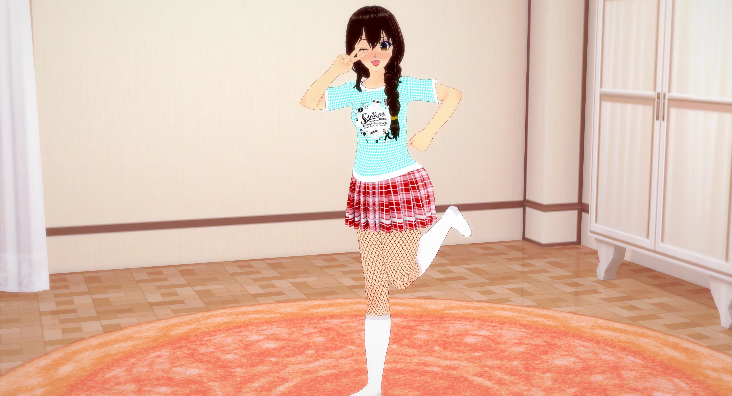
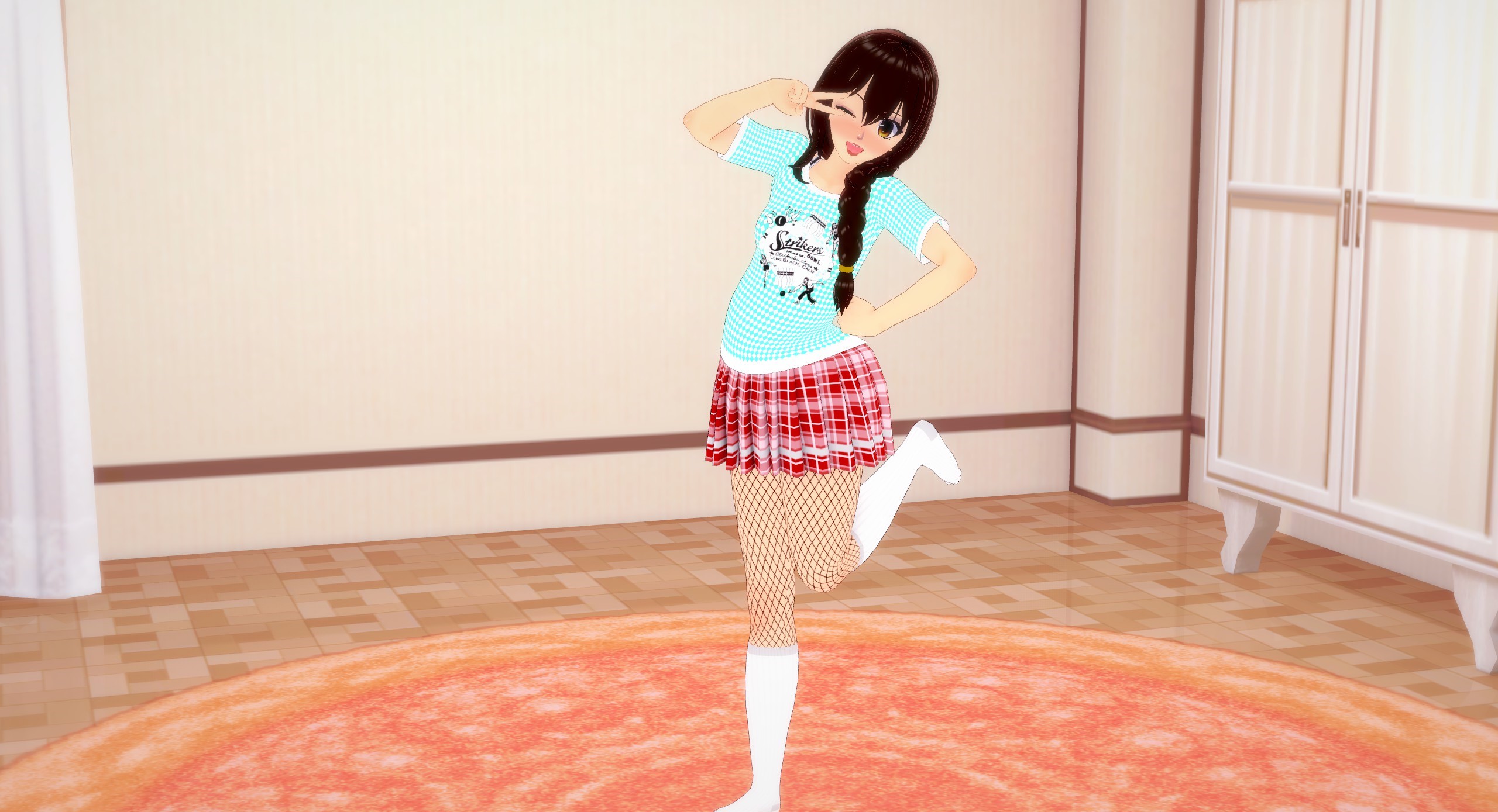
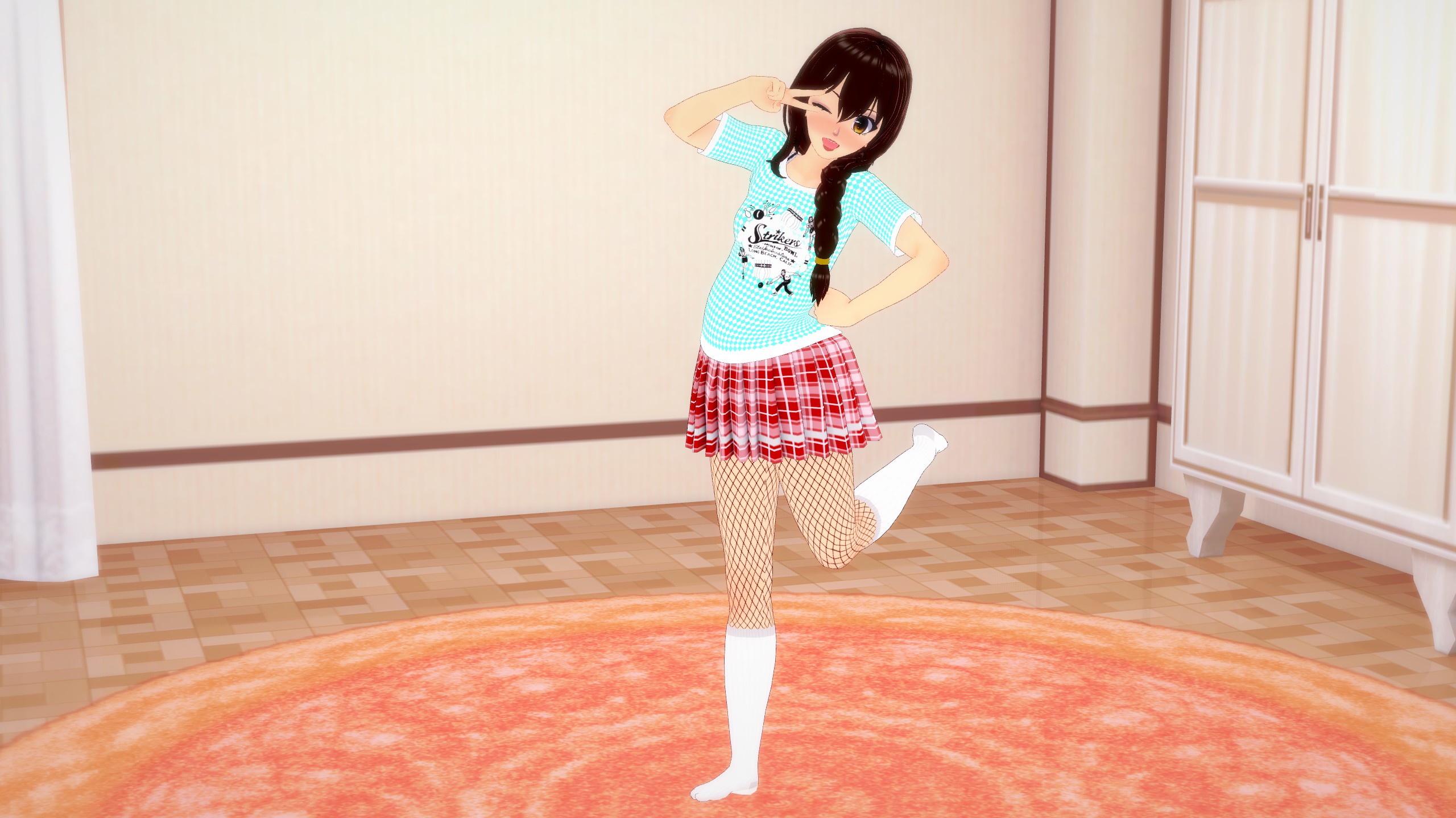
Let’s begin, then. For this picture, I want my character to do a pretty cliche, cutesy anime pose. Maybe winking while holding a peace sign over her face. Okay, Let’s try it out.
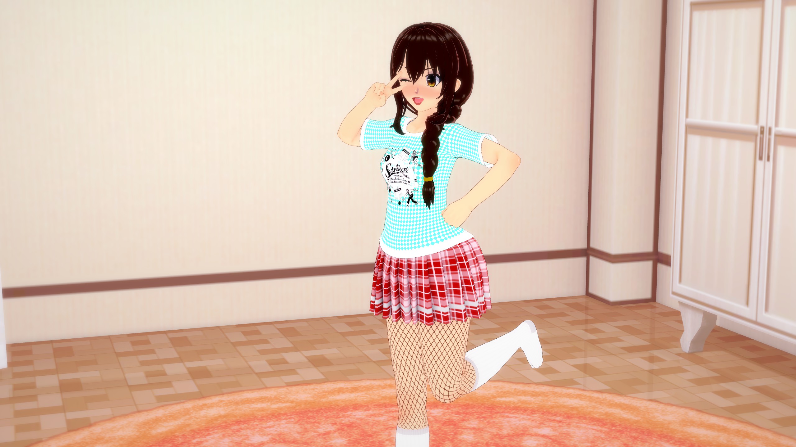
Wow. This just doesn’t look right at all. Her facial expression looks fine but why does this just look horrible? What’s wrong with it? Well… everything. She’s showing us no attention and her pose looks very stiff, unnatural and even uncomfortable. I wanted her to look like she’s having fun and doing a cute pose for us the viewer. At best, it looks like she was told to do this pose by someone off-screen and is only very reluctantly doing it. At worst, she looks like a mannequin that was manually posed like this, completely devoid of life. That stiff and lifeless pose combined with a happy expression again gives us that “Uncanny Valley” look that we’re trying to avoid. So how do we fix it?
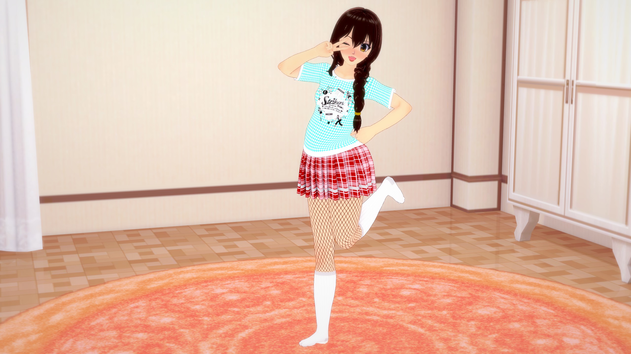
Well there’s frankly a TON that needs fixing. We’re not going to worry about her facial expression because honestly, it works. This isn’t a candid shot, it’s a posed shot so her facial expression is fine, looking a little more forced. Since this is a posed shot and we want her posing for us specifically, let’s have her turn her torso and head to face us.
That’s looking a tiny bit better but it’s still lacking something crucial: weight. Our bodies are heavy and thus are going to fall towards the ground, unless we hold them up, using our muscles and/or limbs or we prop ourselves up against something. Let’s add more weight here by tilting her torso towards the ground
Okay. Not bad, but you know what also has a lot of weight to it? Our heads. Let’s add more weight by tilting her head towards the ground, too.
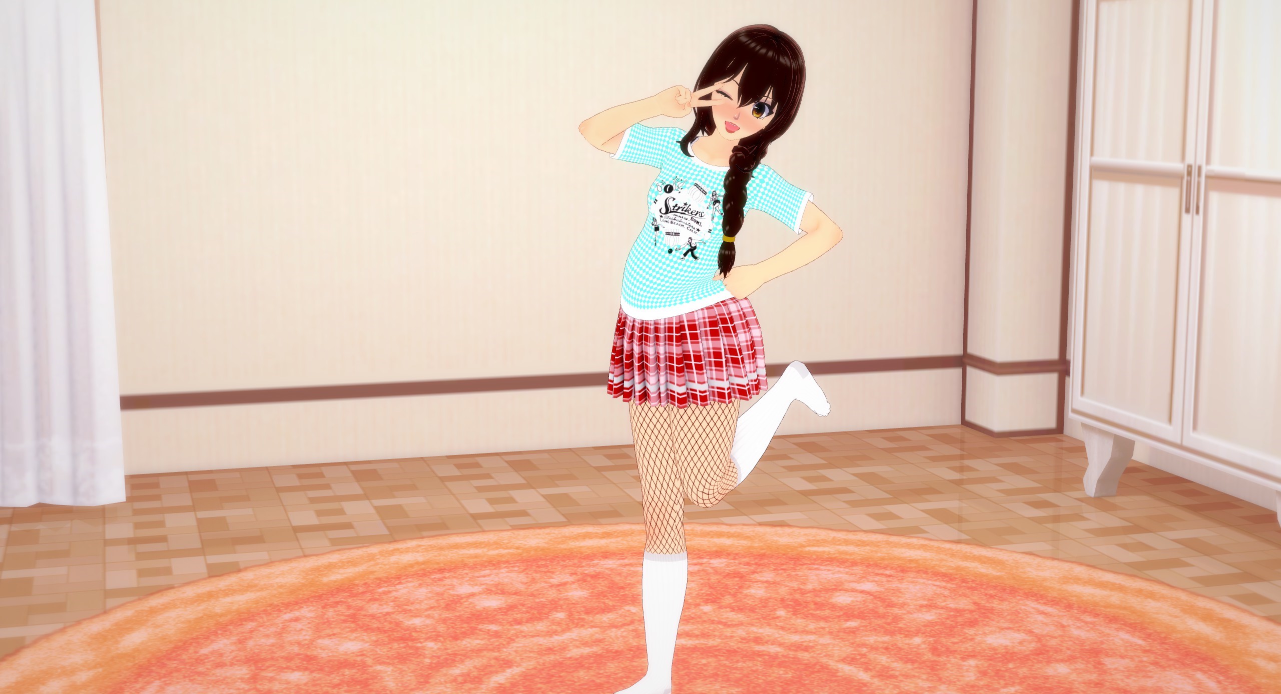
See? The pose is already a lot more lively and interesting to look at. We’re not done yet, though. Every part of our body has weight and thus, we need to express that, in the picture. We’ll start with her right arm.
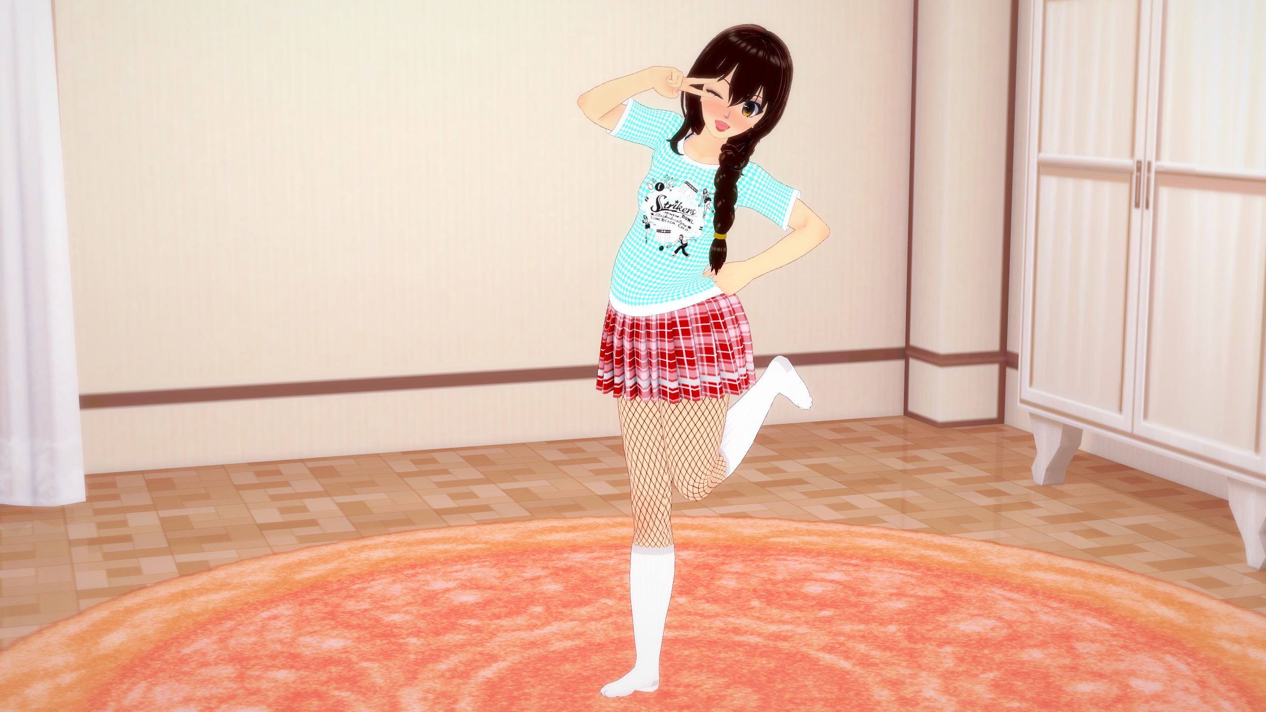
Looking good, but what did I change? Well first, we need to understand that we, as humans, are naturally very lazy and will always want to exert the minimum amount of effort needed. Because of that, when moving our arms around, we’ll naturally want to use the larger muscle groups like our shoulders to do most of the work, while our forearms do a little bit less work and our wrists even less.
So that’s exactly what I did with her arm, to make the pose feel more natural. I moved her arm, using her inner shoulder the most, then her outer shoulder to get her arm up near her face. This allows her forearm to put in less effort and for her wrist (the smallest muscle group here) to almost lazily just dangle her hand in front of her face.
Let’s do the same thing with her left arm. We’ll have her use her fist on her hip as a sort of “anchor point” to keep her forearm up, while using her inner shoulder to carry most of the weight, helping the wrist carry the arm.
Notice how it’s a pretty subtle difference but it still makes this last shot look a lot more interesting and lively than the previous ones. Our brains notice these little differences, whether we’re consciously aware of it or not, and that’s why it’s so important to pay attention to the little details. The smallest adjustments can sometimes make the biggest differences. We’re still not done, though. Her legs still look a little unnatural.
Let’s keep what we’ve learned in mind, but also remember that we naturally will use momentum a lot, in order to move parts of our bodies. With the leg to be in that specific pose, it doesn’t make much sense that she would use ONLY her lower thigh muscles to lift her leg up. She would much more likely use the muscles in her glutes, all of her thigh and even her calf and ankle to bounce that leg up behind her so let’s go with that.
Awesome. We’re also slightly lowering her leg, at the calf, because an action like that requires a good bit of energy and muscle usage which means it would be too hard to do quickly, which is the look we’re going for; like she saw us with a camera and just quickly bounced into this cute little pose, without much thought or effort. Speaking of bounce…
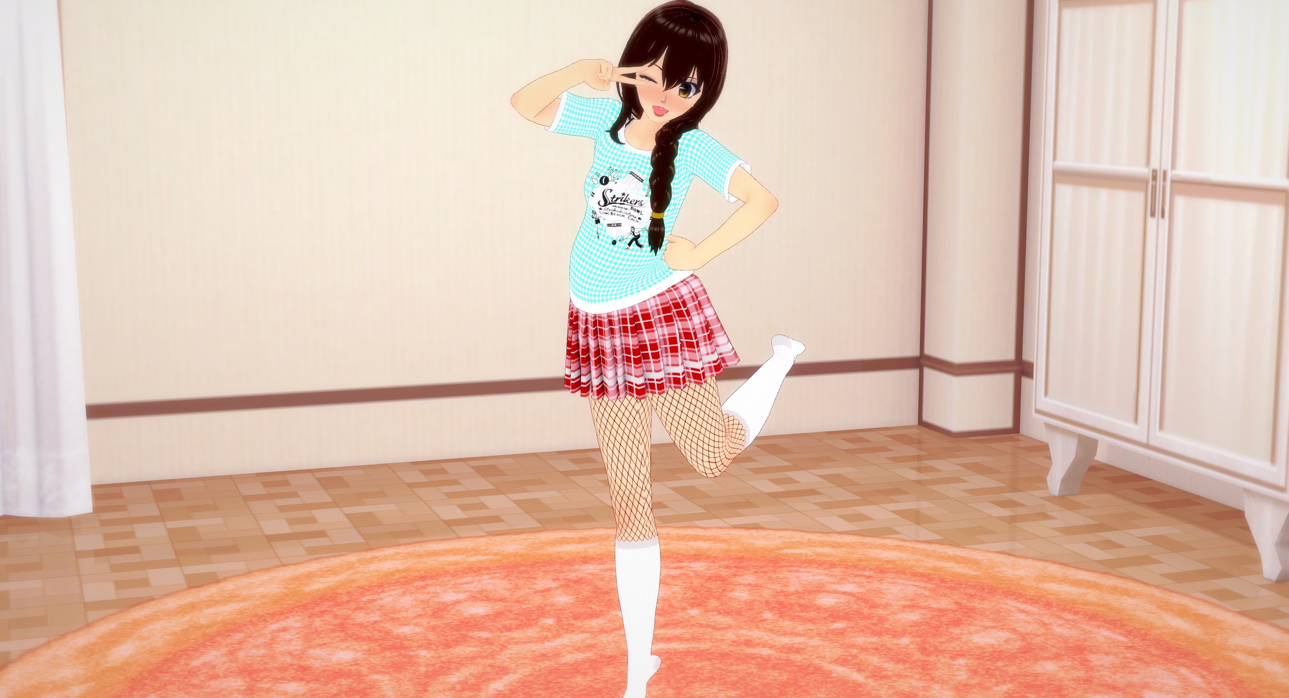
Let’s tilt her entire figure a little bit forward and bring that right leg forward to make her center of gravity more upright and balanced. We’ll also have her standing on her toes to give this shot more action. We want our pictures to look like a still shot from a video or like we caught the perfect moment, in action. A good way to check if you got that part down is by visualizing and mentally checking the character’s “Action Line”. What’s an action line?
Chapter 3: Framing Part 1: Action Line
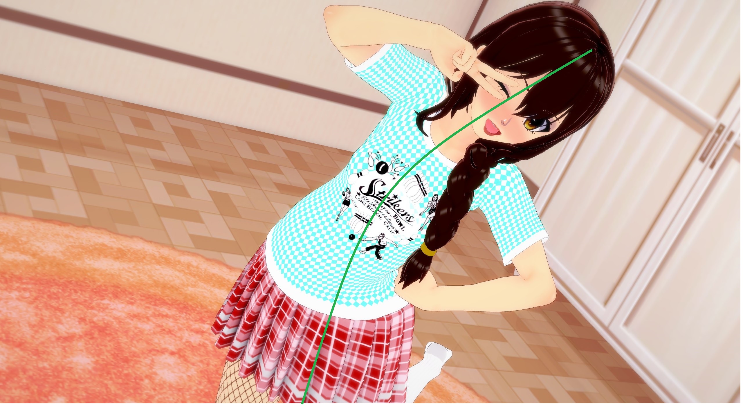
Okay, so we’ve covered the very basics of how to make your character look more alive, and hopefully you have an idea for what can help your character feel more animated. We’re STILL not done yet, though. One thing we need to check is what’s known as our character’s “action line”. We do this by drawing an imaginary line, from our current perspective, going from the top of the character’s head down towards their feet, while staying in the middle of their figure. If we’re doing our jobs right, this line should have noticeable curvature to it and maybe even a few different curves, depending on how far out and animated we want them to look.
Let’s bring back the first picture from last chapter and check it’s action line
It’s almost completely straight, right? That’s a big reason why that picture looks so flat and boring. Let’s look at the action line from the picture of the fixed pose.

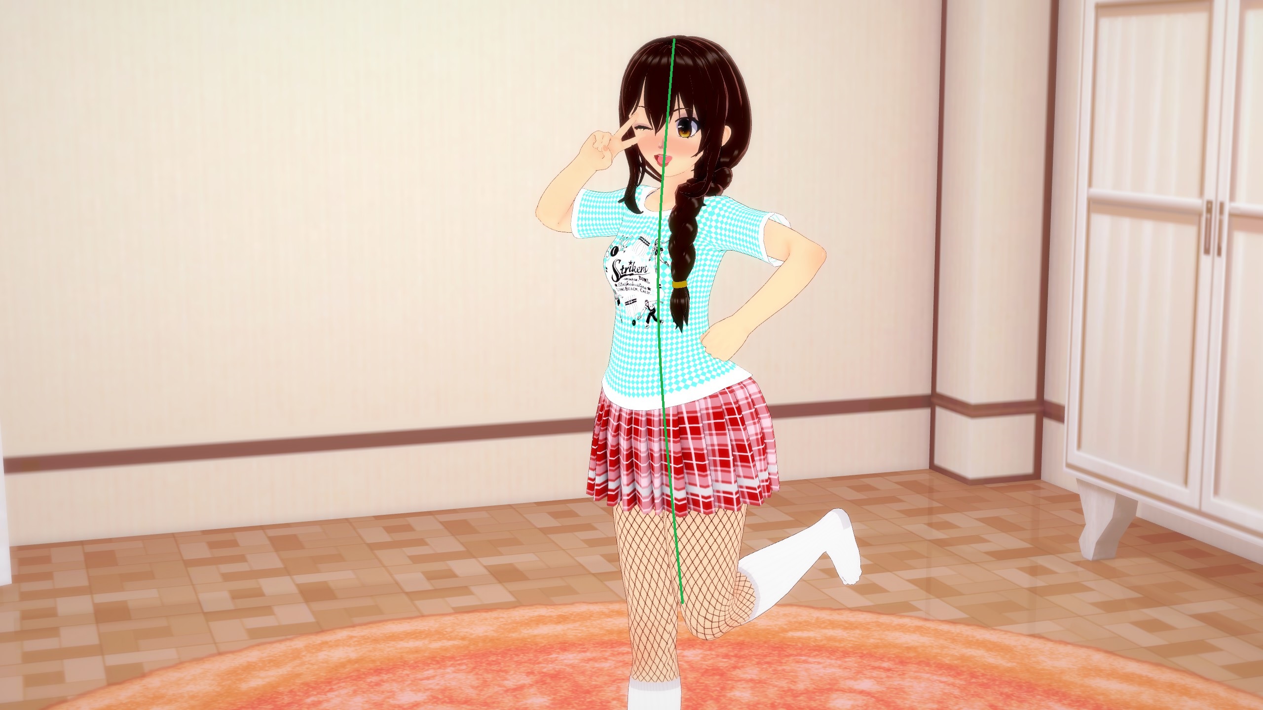
It’s got a good bit more curvature to it, right? But it still isn’t THAT interesting. So how can we make it look more interesting and make her pose look more animated and lively? Simply by changing the angle. Let’s see what I mean.
That action line has a LOT more curvature to it, now. The picture in general just looks a lot more fun too, doesn’t it? It’s because she now has a very lively pose and her action line is a lot more accentuated. We achieved that by moving the camera to an angle where the movement is maybe a little less prominent but she takes up more of the screen, making the action line have to cover more ground. It’s a nice little cheat to make for better action lines. Another little cheat to help with action lines is to rotate the camera to a more exaggerated angle, putting the top of her head and rest of her body in much different sections of the screen. Wait, sections? You mean like the rule of thirds?
Chapter 3: Framing Part 2: Rule of Thirds
Okay, last fancy term I’ll use, in this guide. So what is the rule of thirds? It’s one of, if not the most important rules of thumb for composition. It’s the idea of breaking up a picture into a 3×3 grid and then looking at where the viewers attention is focused. Ideally, whatever is the main focus of the picture should not be directly in the middle square of this grid. We want it to be somewhere else. Let’s look at an example, using the pictures from Chapter 2 (don’t mind my poor grid drawing abilities, my point will still stand).
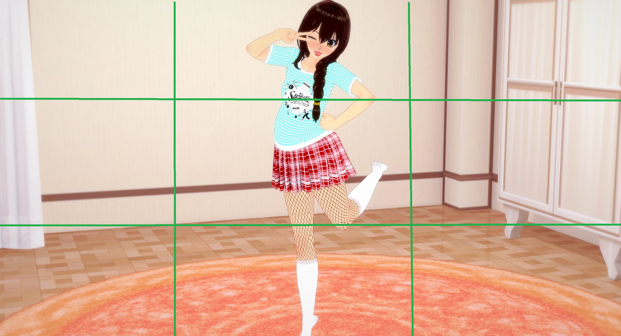
Notice how our main focus (her face) isn’t in the central square but instead up in the upper middle square? This is what I’m referring to. The composition in this picture still isn’t all that good though. Our subject is still perfectly in the middle column of the frame, leaving us with an entire left and right column of dead space. Dead space, in art, refers to any area where there isn’t anything going on or anything interesting to look at. Dead space CAN be used intentionally, to create pictures that feel lonely or show a subject looking small but in general, you want to have as little dead space as possible. Let’s look at the last picture from last section again to see a better composition, according to the rule of thirds.
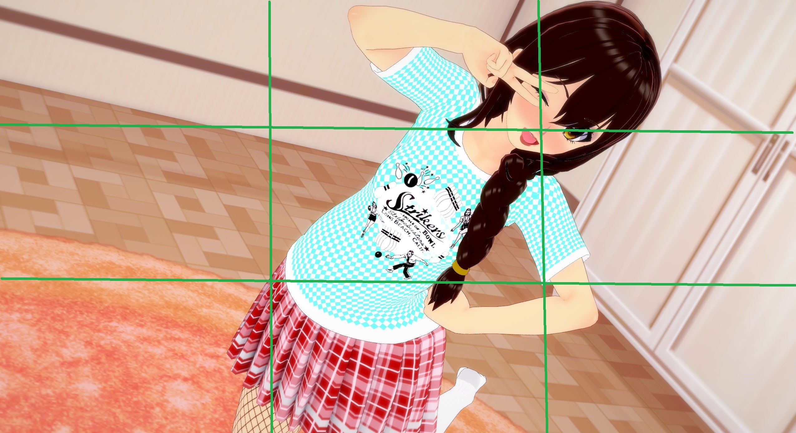
See? Our main focus of this picture, her head, is mostly in the top middle and top right sections of the frame. Not only that but by zooming the camera in, we allow her to take up more of the frame which allows us to eliminate a lot more dead space, while only having the one subject.
Chapter 3: Framing Part 3: Camera Angle
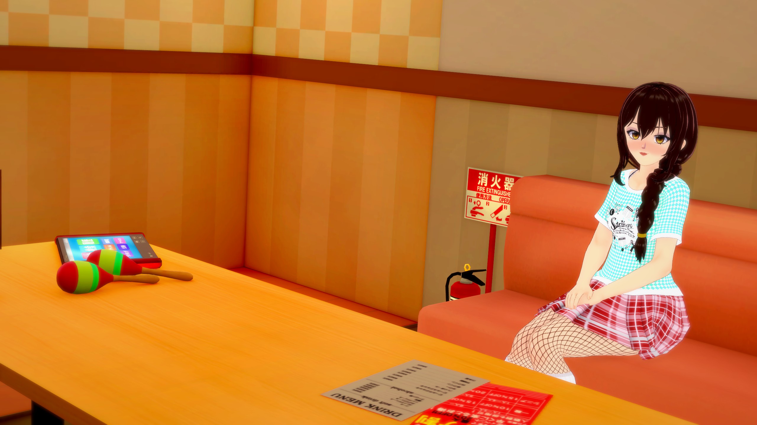
The last framing trick we used to make the last shot look nicer is simply where we put the camera and how we angled it. On a basic level, if you want something to appear more cutesy, angle the camera higher, looking down to make the subject appear a bit smaller. Want the character to be more imposing? Angle the camera lower, looking upward to make the subject seem larger. Want the shot to feel more intimate or serious? Move the camera in closer to the character(s) to make us (the viewer) feel like we’re there with them. Want the opposite effect? Move the camera out further to make it feel like not even the viewer is giving our subject company. It’s not all that black and white, though. There’s a lot more subtlety to it than that, but we’re only here to cover the basics. Let’s take some pictures with what we’ve learned so far, and let’s see what each picture “says”.
This picture says that It’s her, alone in the karaoke room. Kinda sad…
This picture says that it’s just the two of you, in this karaoke room. How romantic.
And this picture says “If you bore me, I’m going to be VERY upset. Do you understand?”
Well… DO you understand? With only very minimal adjustments made to her pose, we were able to say all sorts of different things about who this character is. Almost exclusively by just moving the camera around, we made our character seem like a loner, then like a cute love interest, then into someone who might beat us up.
Chapter 4: Review and Outro
As we reach the end of this guide, I hope you’ve started to train your eye to notice what needs fixing in a photo and what looks good. Let’s put it to the test with a few sample pictures. See if you can find what’s wrong with the first picture and then we’ll see it improved, in the second picture.
First Picture:
Facial Expressions: Good
Posing: Great
Framing and Camera Angle: Boring
First Picture Fixed:
Fixed the framing to make this picture tell more of a story. “You just got caught, peeking at the punk girls”.
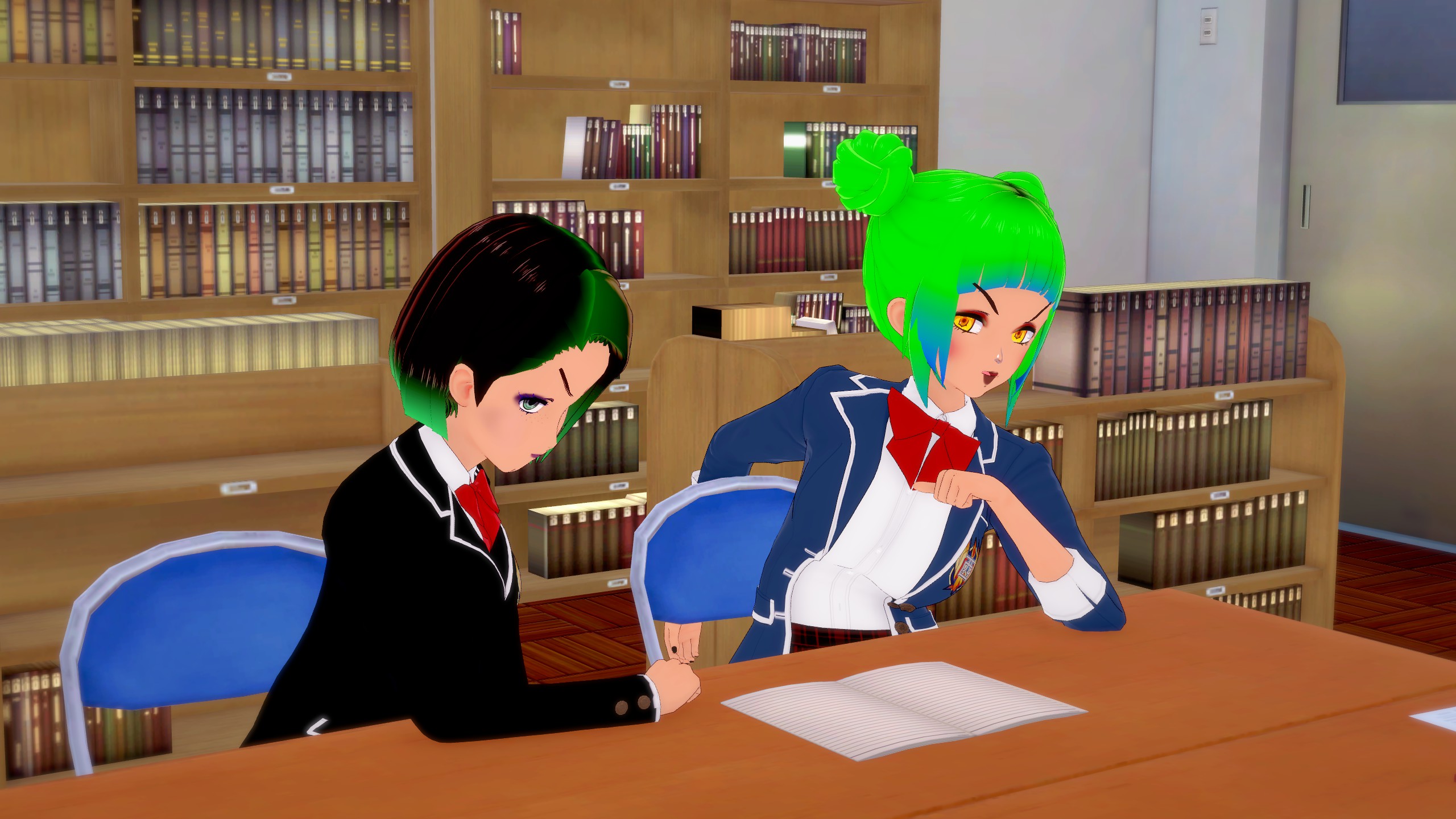
Second Picture:
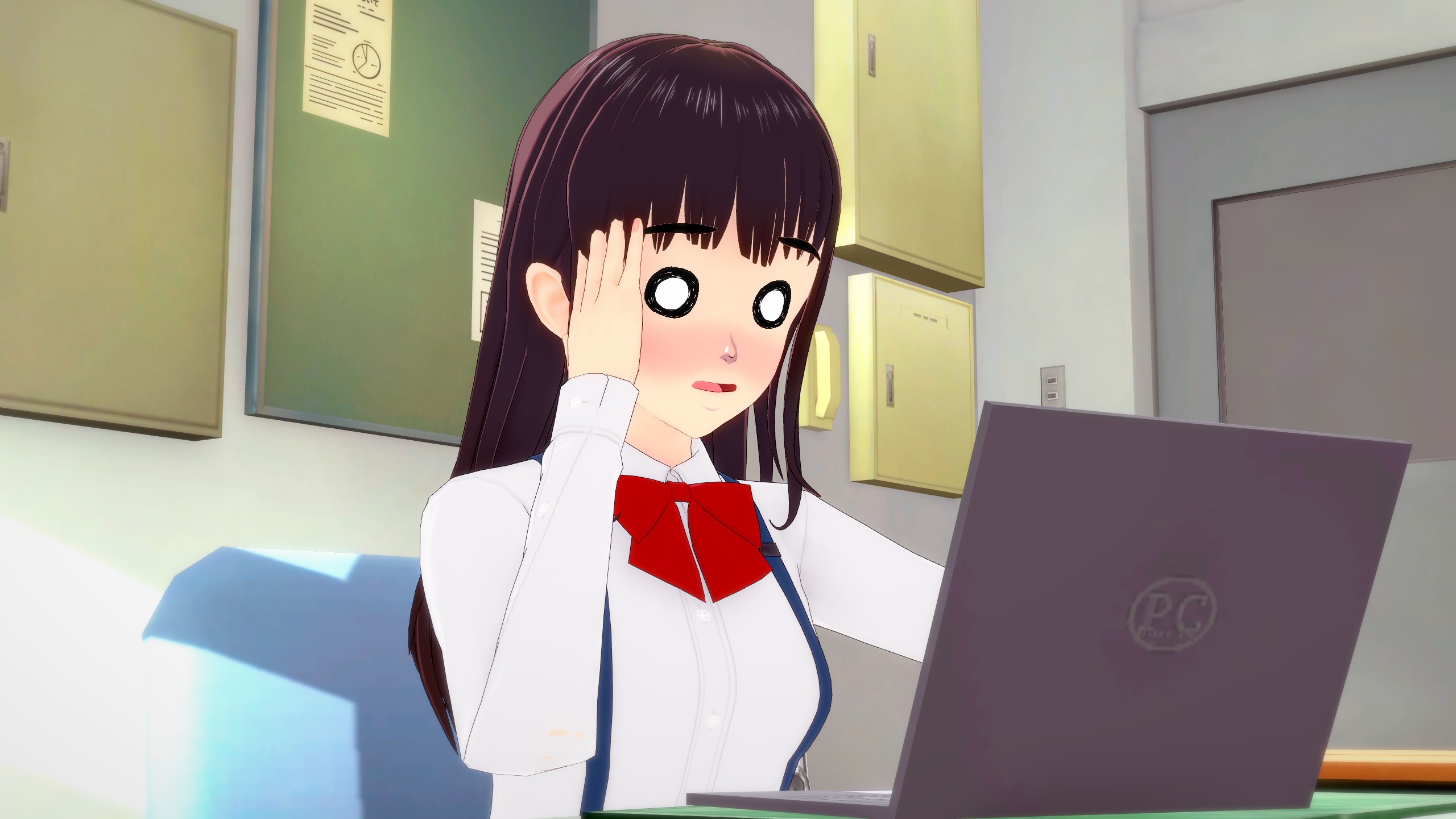
Facial Expression: Great
Posing: Awful
Framing and Camera Angle: Average
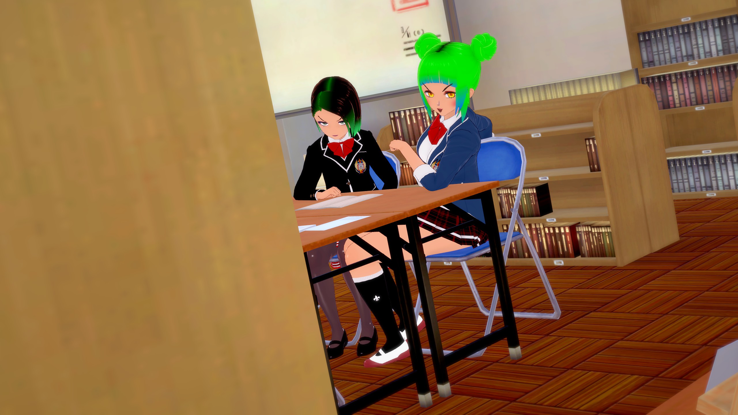
Second Picture Fixed:
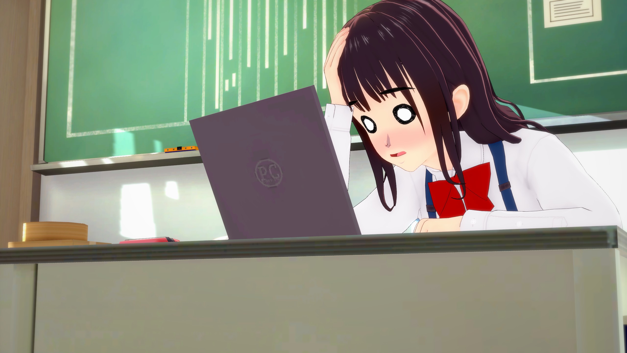
Better framing and her exaggerated pose really emphasizes how much she’s struggling with that laptop
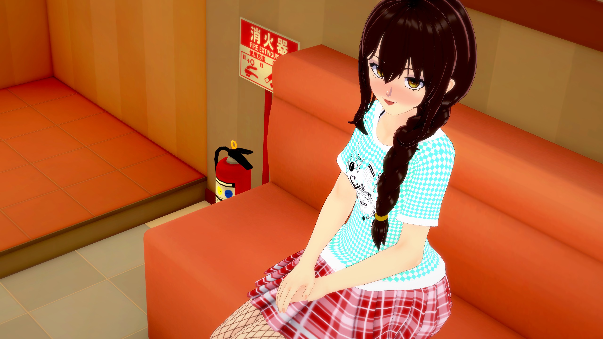
Third Picture:
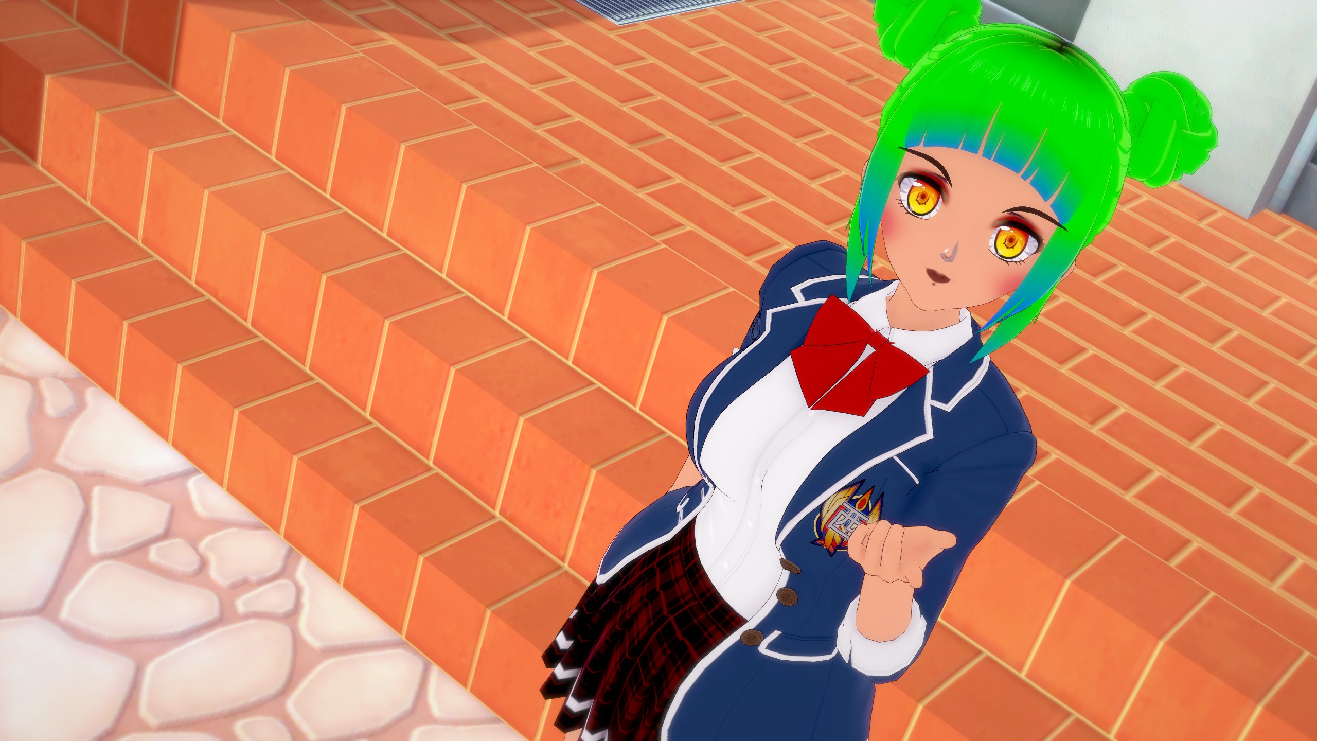
Facial Expression: Boring
Posing: Good
Framing and Camera Angle: Good
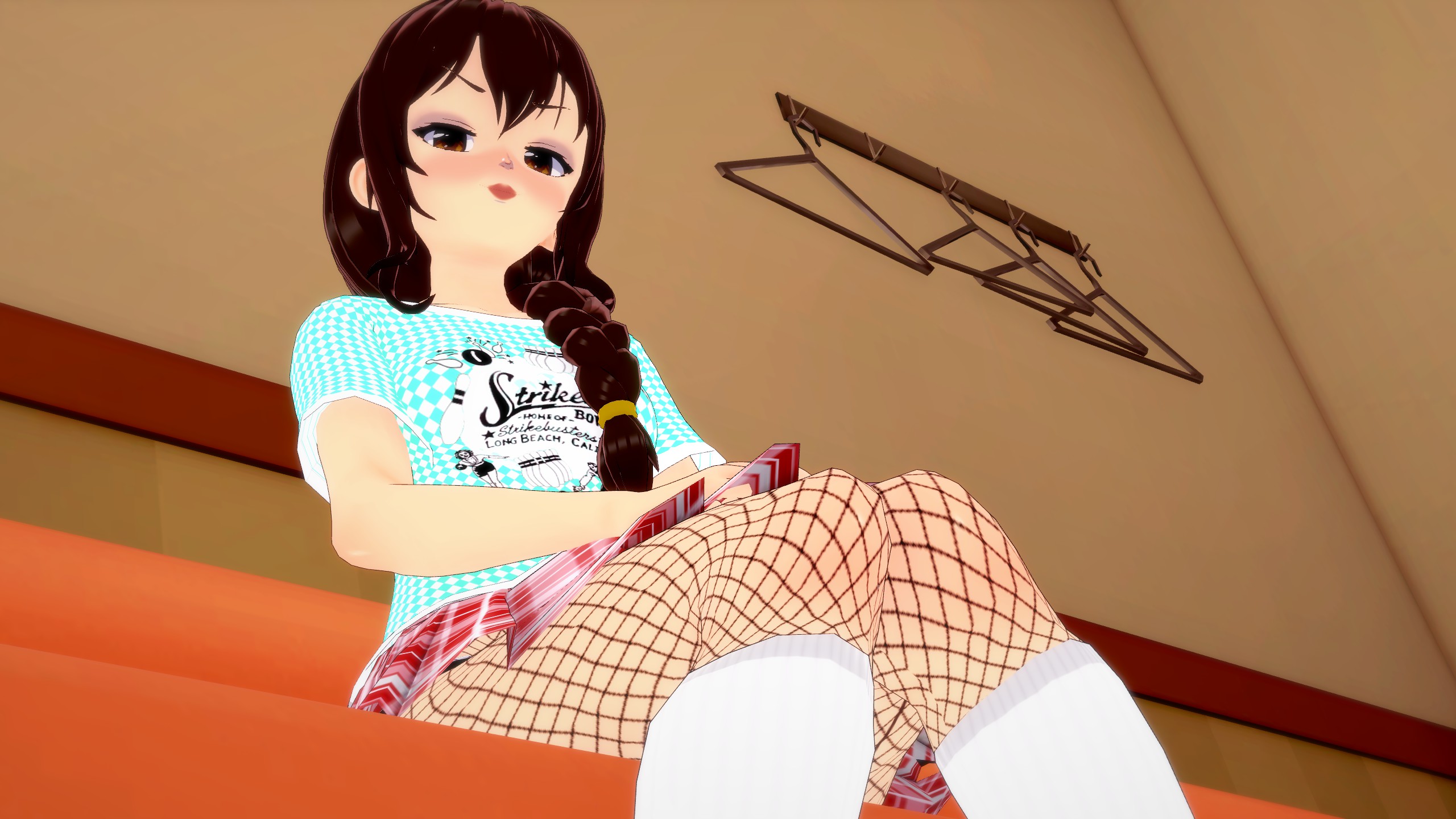
Third Picture Fixed:

A smile is fine enough, but with a character who has such a vibrant and eye-catching look, it doesn’t really match. Why not make it more fun by having her do something like a wink and blowing a kiss?
And with that short little test, my time here is up. I hope you were able to learn even just a bit more about art, with this guide. If you did, then go out there and start taking some pictures or screenshots. Hell, send some of your screenshots my way. I would love to see your characters and also wouldn’t mind giving feedback. Art is all about expression so once again, go out there and express yourself!